Monday, January 17, 2011
Giveaway Tomorrow....
Tomorrow I'll announce our surprise giveaway valued at $400. Here's a clue....this darling butterfly mobile can be easily made with our giveaway machine.

Labels:
DIY projects
Gender-Neutral Modern Baby Rooms
Muted greys, pale blues and soft browns in a nursery can evoke images of a boys room - but this gender-neutral nursery could work for a boy or girl. Clever idea using the picture ledge to place random styles and colors of the the alphabet. Curtains from IKEA. Great choice of contemporary fabrics. Blue nursery wall paint color: Cloud Nine ICI Paints #30BG 72/034
It's Great To Be Home featured Sarah Richardson's gender-neutral nursery she designed
"I HAD A 'NO BUNNIES' RULE,” laughs designer Sarah Richardson, describing the chic yet playful nursery she designed for her new baby. “I wanted there to be colour, energy, vitality and happiness, but not the traditional nursery trappings.” For the star of HGTV’s Design Inc., the magic lay in customized pieces from her own furniture collection, a sleek ’n’ sweet designer crib, and a sophisticated cream, red and walnut palette.
Stokke Sleepi Crib Walnut
Adler Giraffe Wall Sconce in White Babyletto Modo 3-Drawer Changer in Espresso
Labels:
baby nursery
Surprise, Surprise....
Tomorrow (Tuesday) we are hosting a very cool giveaway valued at {almost} $400!! Make sure to check back to see what the wonderful giveaway is. This is for sure a very loved item that you would want to win.
I LLLOOOVVEEEE IT and so will you!!!
Labels:
giveaway
Friday, January 14, 2011
Kids Rooms: Fabric and Padded Walls
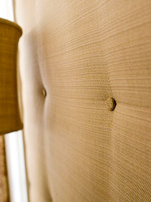
A fabric-covered wall gives a dramatic effect as a perfect backdrop for a focus wall in a nursery, kids room or playroom. A padded wall feels cozy in a bedroom, adds texture and interest, keeps the room warmer, and muffles sound. Wouldn't this wall look beautiful behind a crib? Similar fabric found here .
.
The focus wall is covered in a damask wallpaper (this could also work with fabric). An easy way to attach fabric to walls is by using starch. Instructions found here.


Graham and Brown Pink York Wallcoverings Linen Hot Pink York Wallcoverings Damask
This elegant room might be a little over the top with padded walls. But I do like the effect a padded wall can give. I personally prefer one accent wall that has been upholstered.
Soft padding on one wall makes for an elegant statement. Another set of instructions on how to upholster a wall found here.
Floor-to-ceiling headboard makes a statement for a room and gives it an "upholstered wall" look.

Graham and Brown Pink York Wallcoverings Linen Hot Pink
Ceiling draped in fabric. Both images from Little Crown Interiors
This elegant room might be a little over the top with padded walls. But I do like the effect a padded wall can give. I personally prefer one accent wall that has been upholstered.
Soft padding on one wall makes for an elegant statement. Another set of instructions on how to upholster a wall found here.
Close up image of the wall shown above.
Floor-to-ceiling headboard makes a statement for a room and gives it an "upholstered wall" look.
Designer: Noel Jeffrey
Image via here.
Thursday, January 13, 2011
Creative Dessert Displays
In my last post we discussed designing fabulous backdrops for your dessert tables. Today I want to show you some examples of creative ways to display your desserts. The party doesn't start and end at the cupcake stand, ladies!
I love how in this ice cream parlor station the toppings are neatly and beautifully displayed in a cutlery box that's been painted white. The box adds so much interest and gives the table a more professional look, than say... bowls. (Eat Drink Chic)

Check out how cute these cupcakes look when displayed in a cabinet instead of a cupcake stand! Now that makes a statement. (Katie Cassidy Photography, via Celebrations at Home)

How about displaying your desserts in a bookcase rather than on a table! (P.S. I Love This)

And while we're talking about creative dessert displays, the next photo takes the cake! The dessert was displayed on a miniature pink picnic table! Adorable, fun and unique. (Jose Designs)

I love the charming look of this 2 tiered buffet table. It was an old piece, given a new life with a coating of paint in a happy color, and it serves treats in an old world enchanting sort of way. (Pen N' Paperflowers)

![]()


Aluminum Scoops 5 Ounce Paint it any color Kids' Picnic Table

I love how in this ice cream parlor station the toppings are neatly and beautifully displayed in a cutlery box that's been painted white. The box adds so much interest and gives the table a more professional look, than say... bowls. (Eat Drink Chic)

Check out how cute these cupcakes look when displayed in a cabinet instead of a cupcake stand! Now that makes a statement. (Katie Cassidy Photography, via Celebrations at Home)

How about displaying your desserts in a bookcase rather than on a table! (P.S. I Love This)

And while we're talking about creative dessert displays, the next photo takes the cake! The dessert was displayed on a miniature pink picnic table! Adorable, fun and unique. (Jose Designs)

I love the charming look of this 2 tiered buffet table. It was an old piece, given a new life with a coating of paint in a happy color, and it serves treats in an old world enchanting sort of way. (Pen N' Paperflowers)

Aluminum Scoops 5 Ounce

Amy Oren is author of the Blowout Party blog, and owner of BlowoutParty.com. Catch her on Facebook.com/BlowoutParty
Subscribe to:
Comments (Atom)


